Brand Identity / Retail Concept / Print & Signage
Brand identity for a bookstore, plant shop, and café. Built to feel calm and inviting without feeling overstyled.
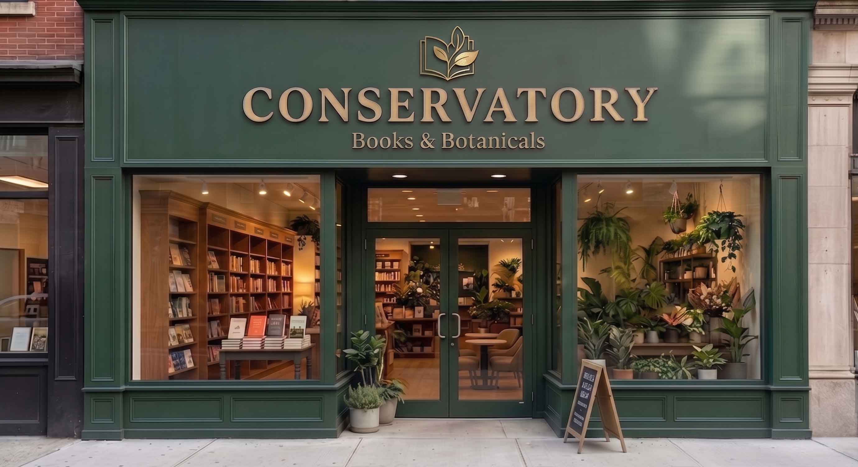
Conservatory brings books, plants, coffee, and lifestyle goods into one space. The goal was to make four categories feel connected, not crowded or randomly placed together.
Goal: a warm, recognizable identity for signage, packaging, and print. Refined, flexible, and practical.
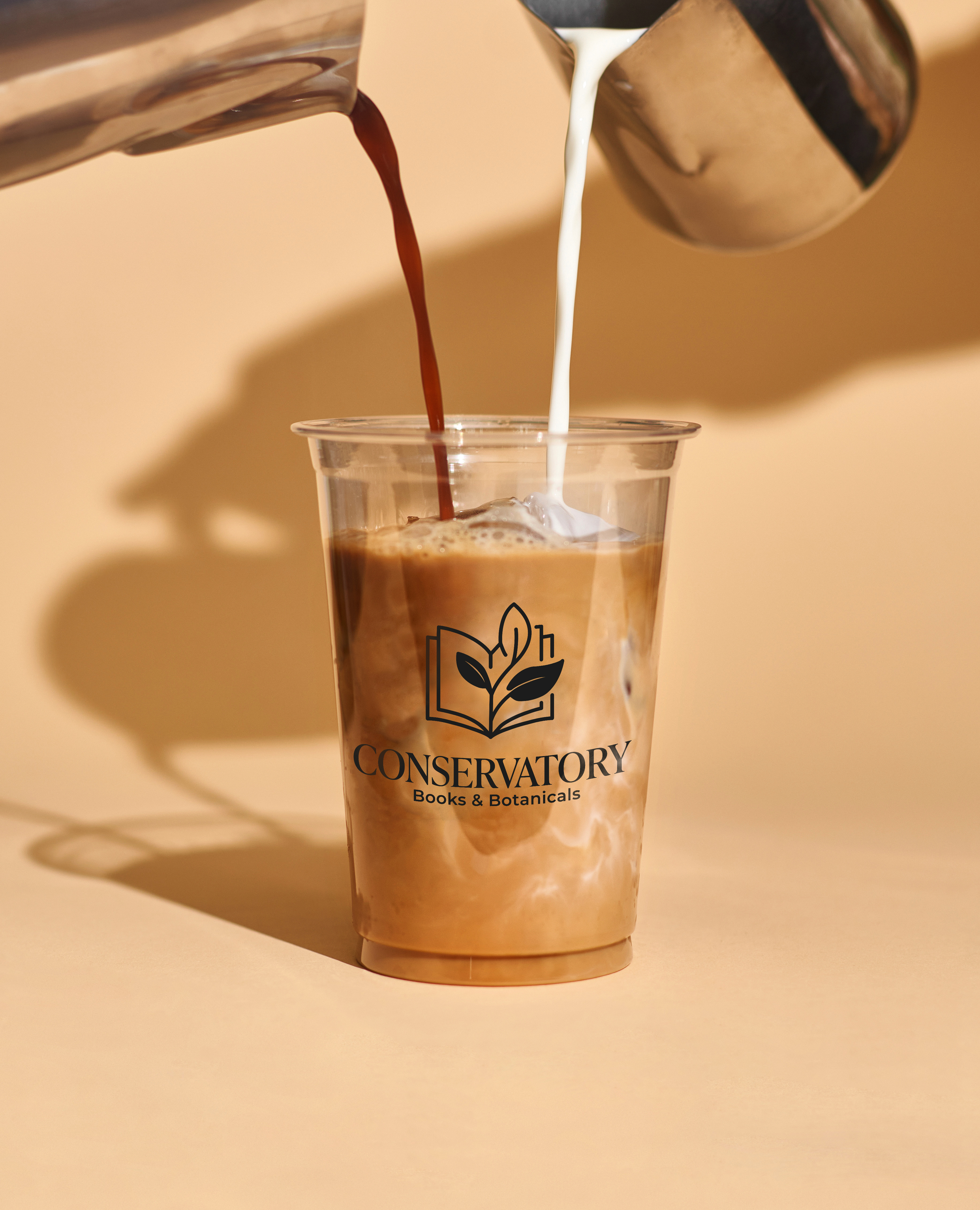
An open book meets botanical shapes, suggesting reading, growth, and a quiet retail experience.
Early marks leaned too antique. The final direction keeps the bookshop charm, then simplifies the system for signage, packaging, web layouts, and small digital icons.
Idea 01

Idea 02
Idea 03
Final Logo
Mobile Icon

Black
Green
White

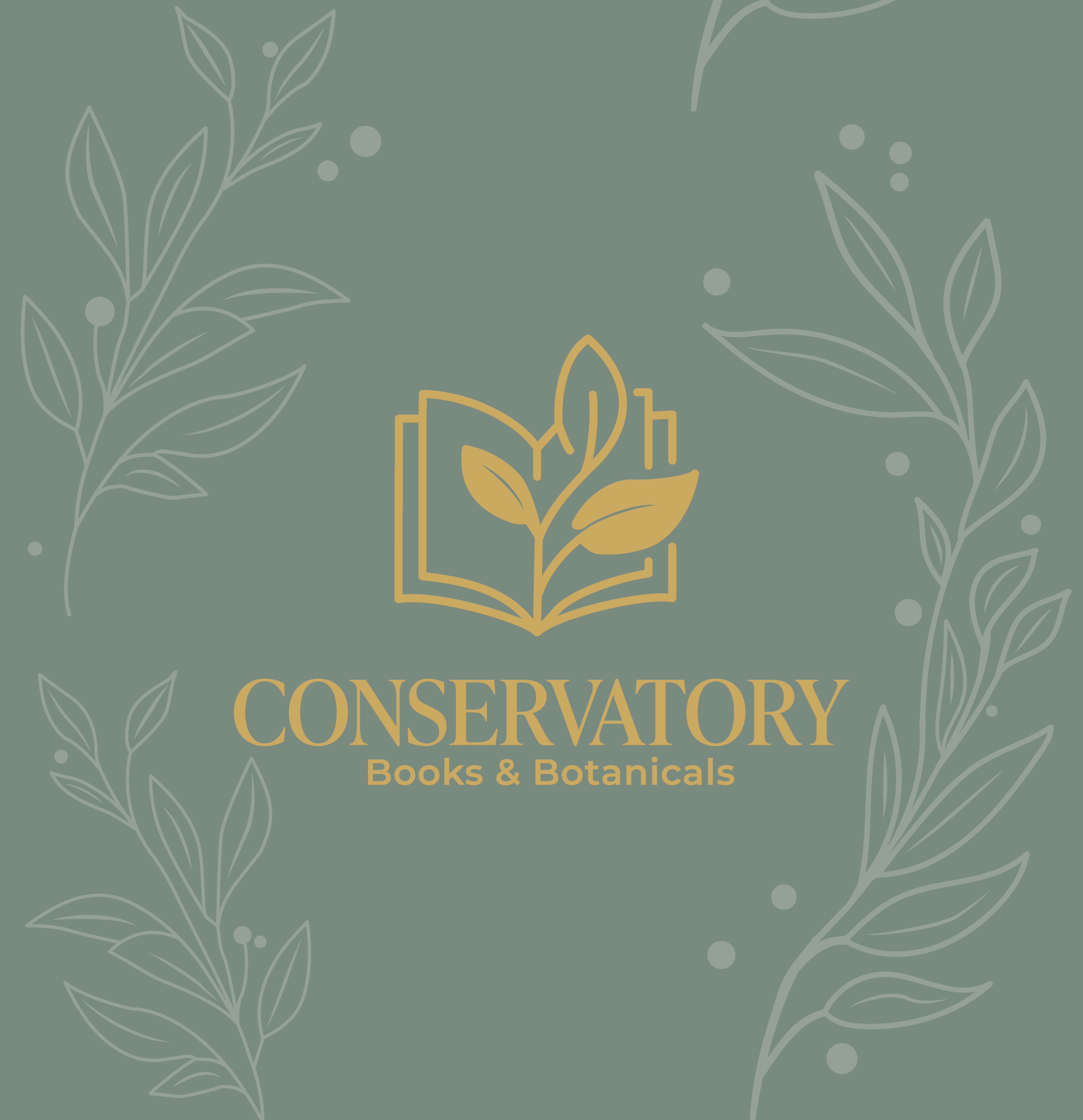
Earthy colors, clean typography, botanical ornament, and repeating patterns give the brand structure while keeping its warmth.
Color Palette
#2F5D50
Bayberry Green
#C6A75E
Antique Gold
#F3EFE6
Antique Cream
#222222
Soft Charcoal
Typography
Effra CC VF
Effra CC VF
Primary type for menus, descriptions, prices, labels, tags, and wayfinding.
Montserrat
Montserrat
Used for headers (h1/h2).
Pattern & Ornament



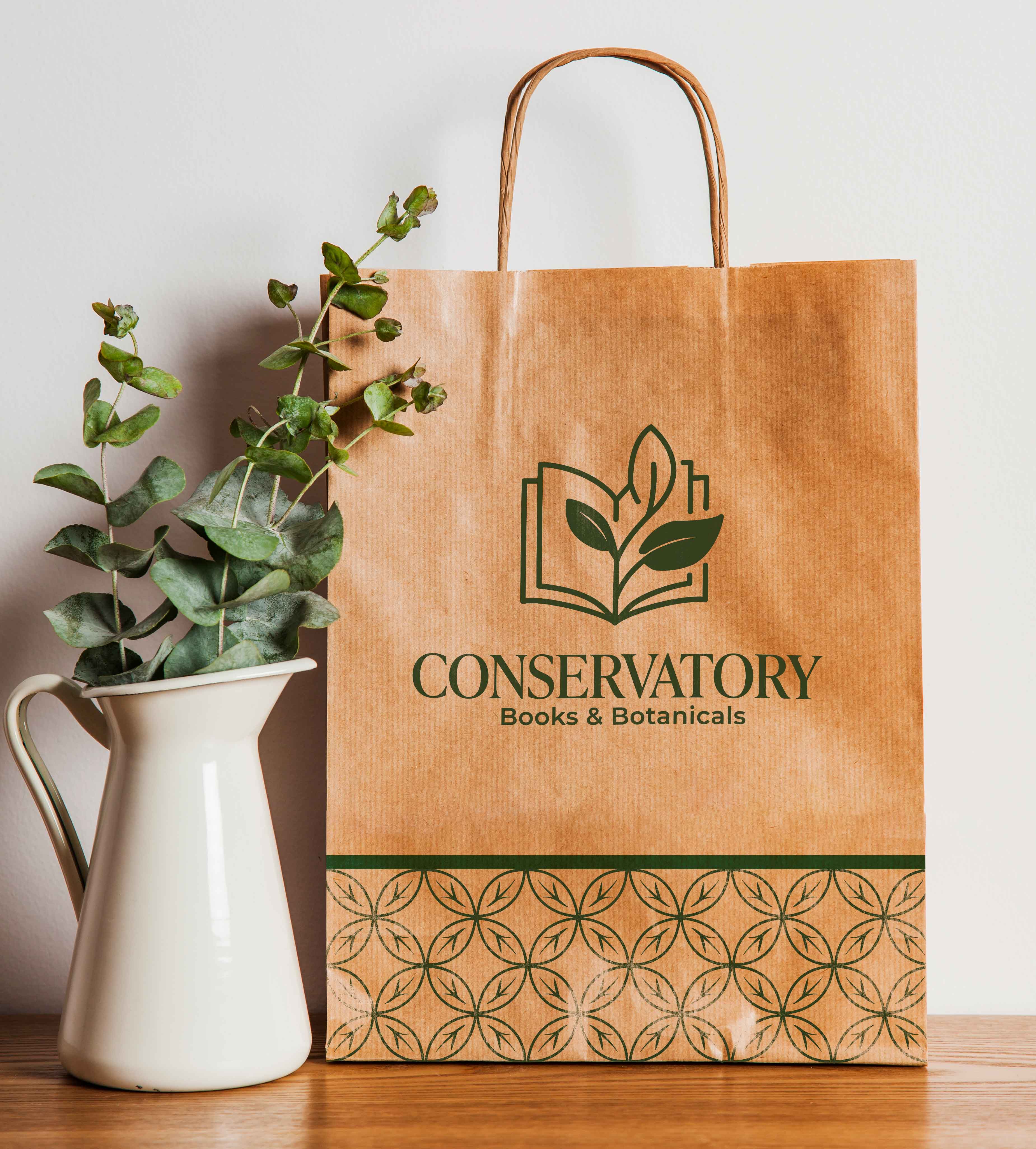
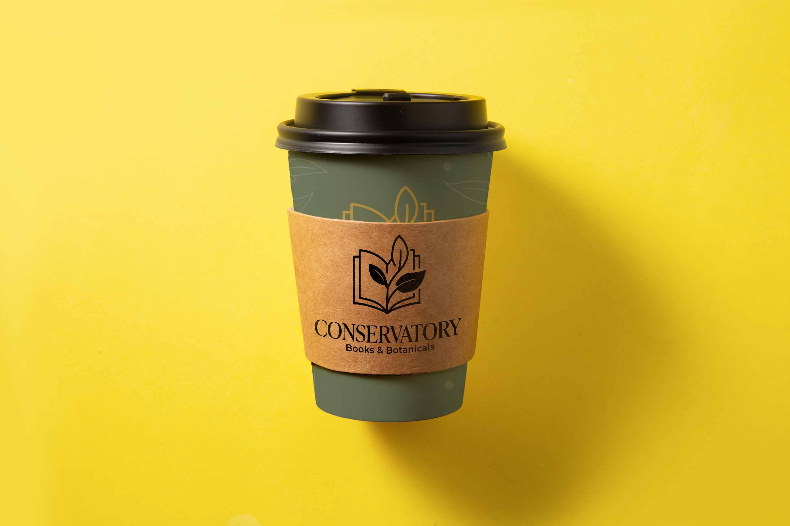
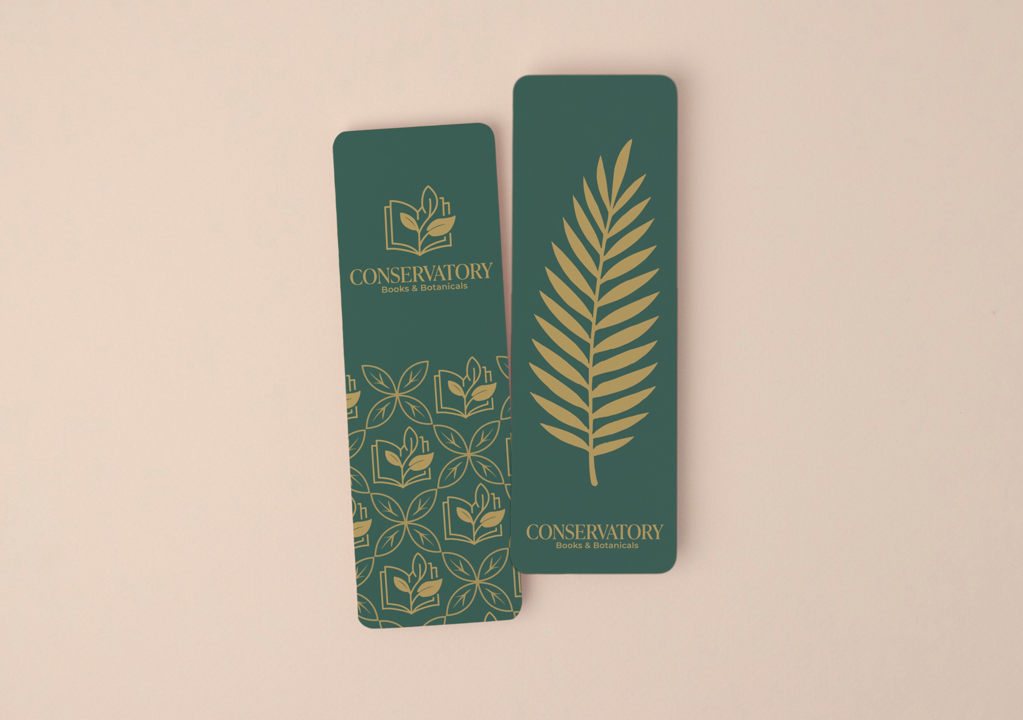
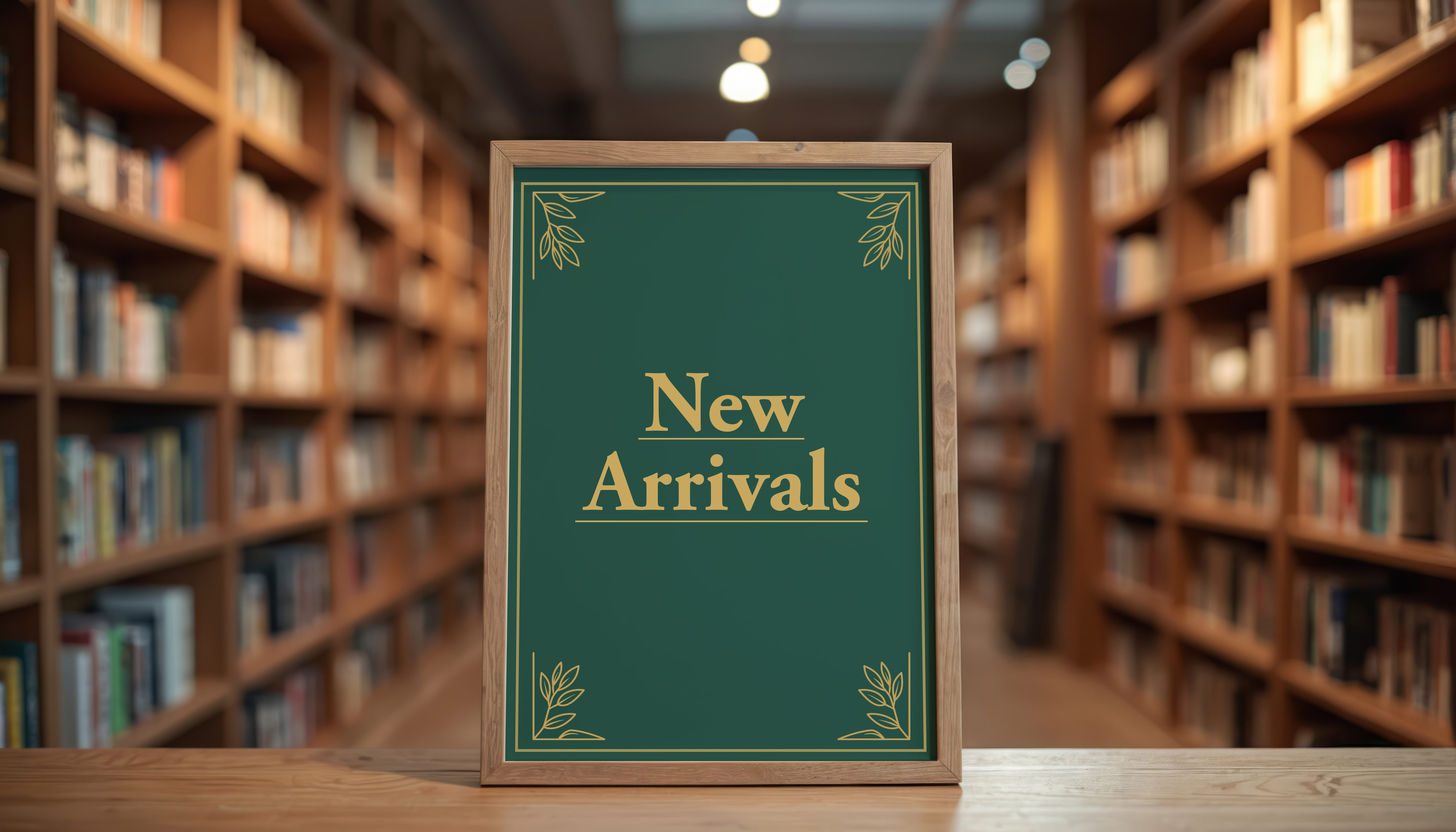
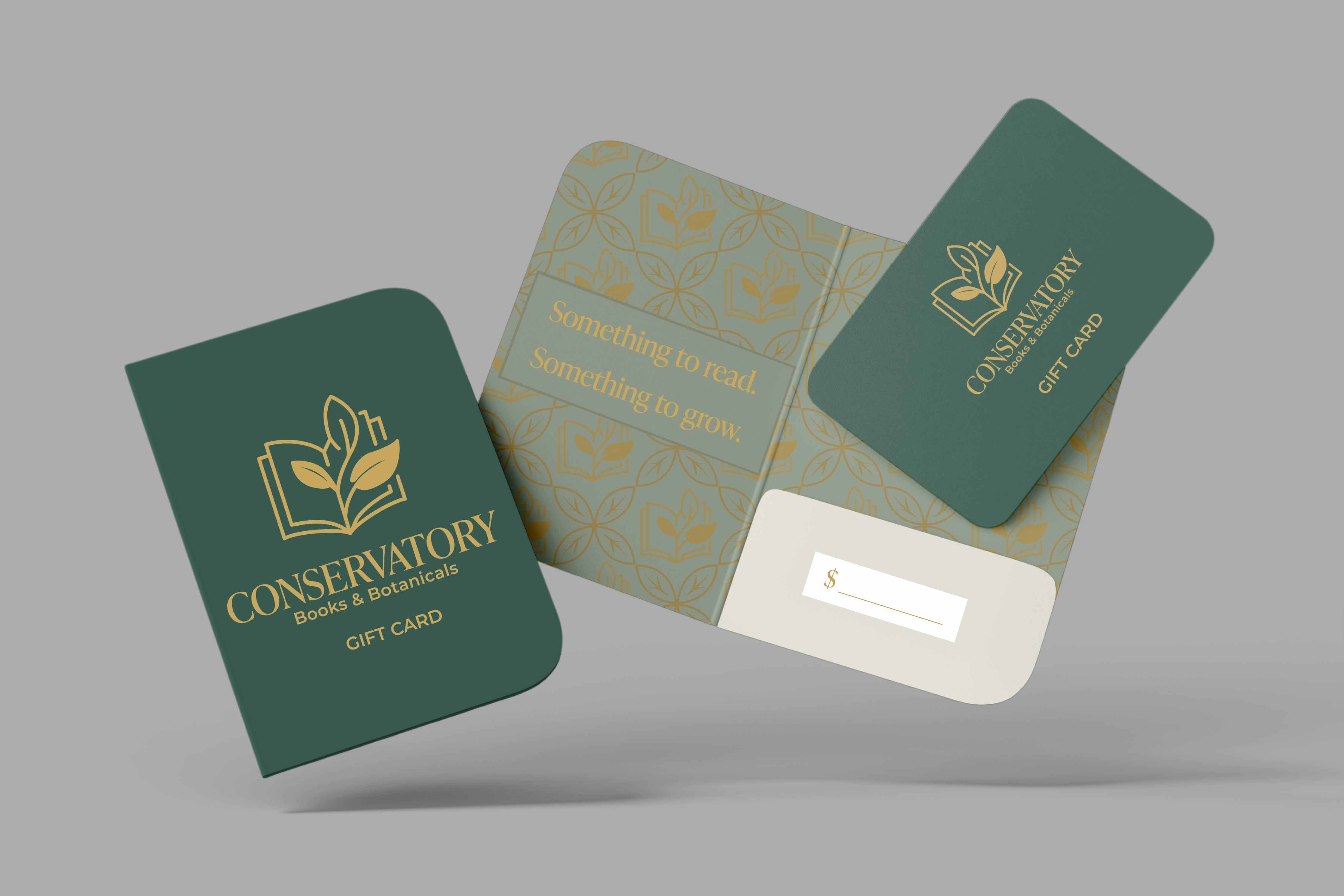
Books, plants, and coffee each get their own touchpoints, while the visual system keeps the shop feeling like one complete brand.


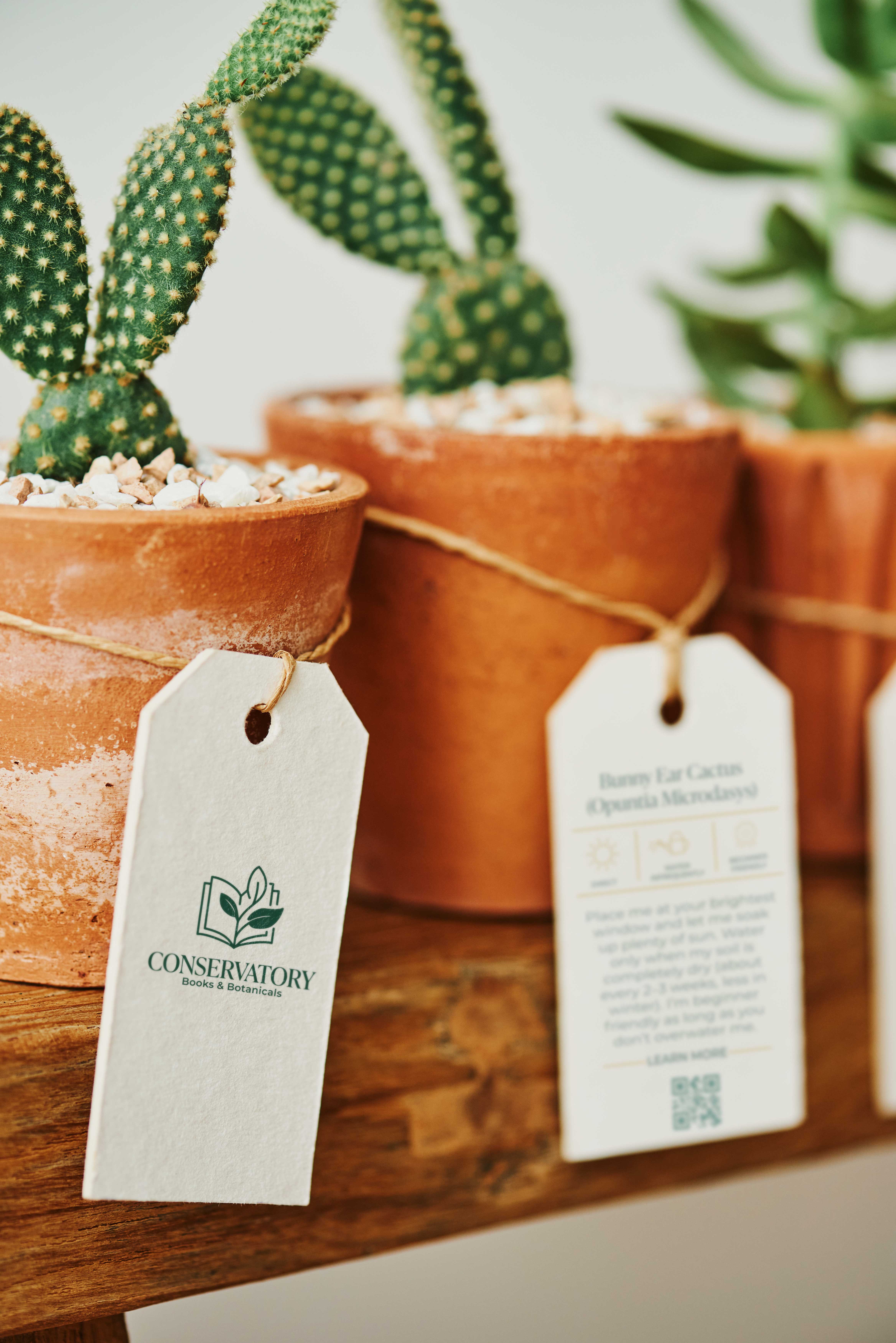
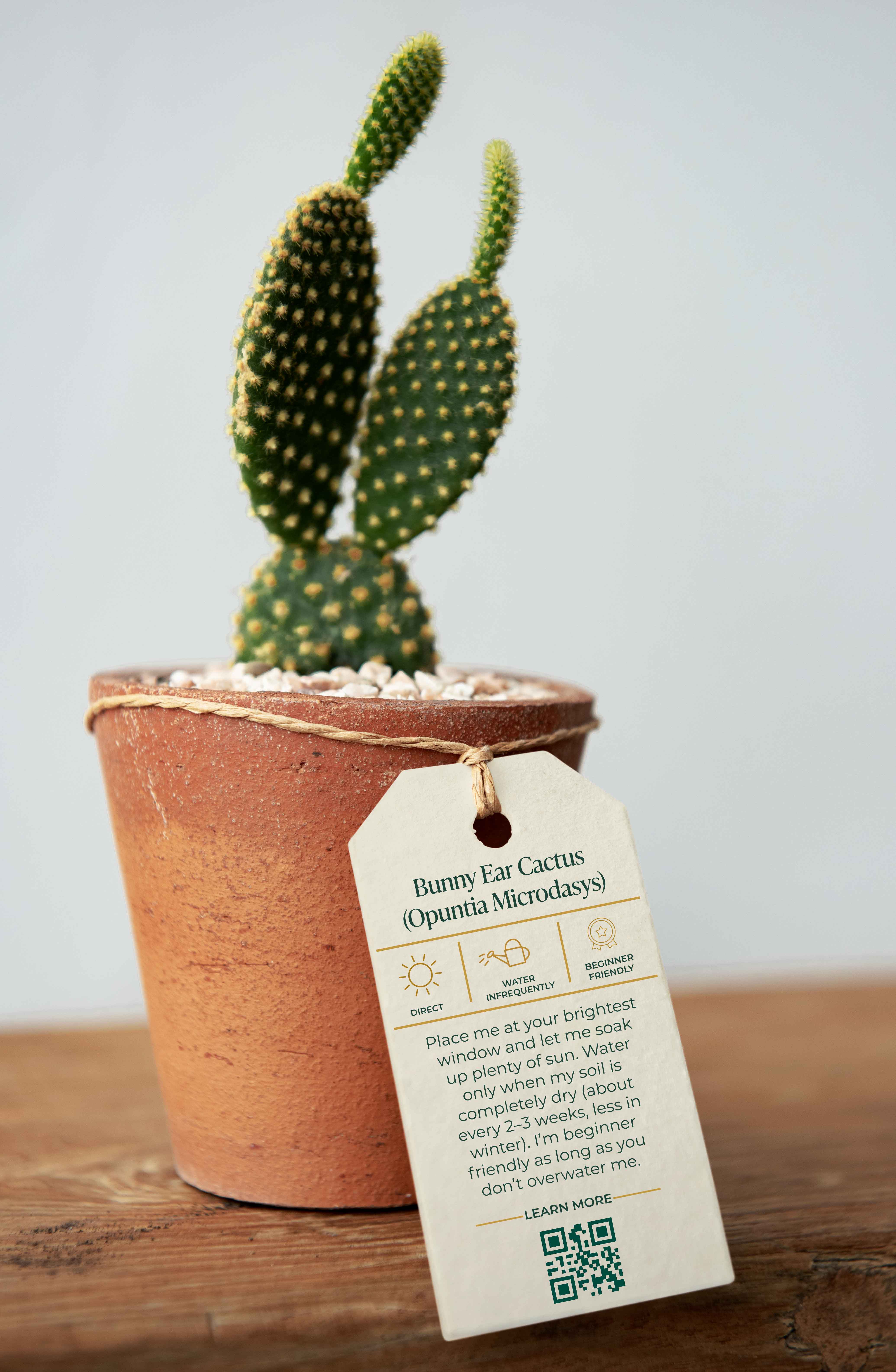
The plant tags extend the brand into the customer experience with clear icons for sunlight, watering, QR access, and plant-care difficulty.
Easy

Intermediate

Expert

Direct Sun

Part Sun

Indirect Sun

Shade

Water

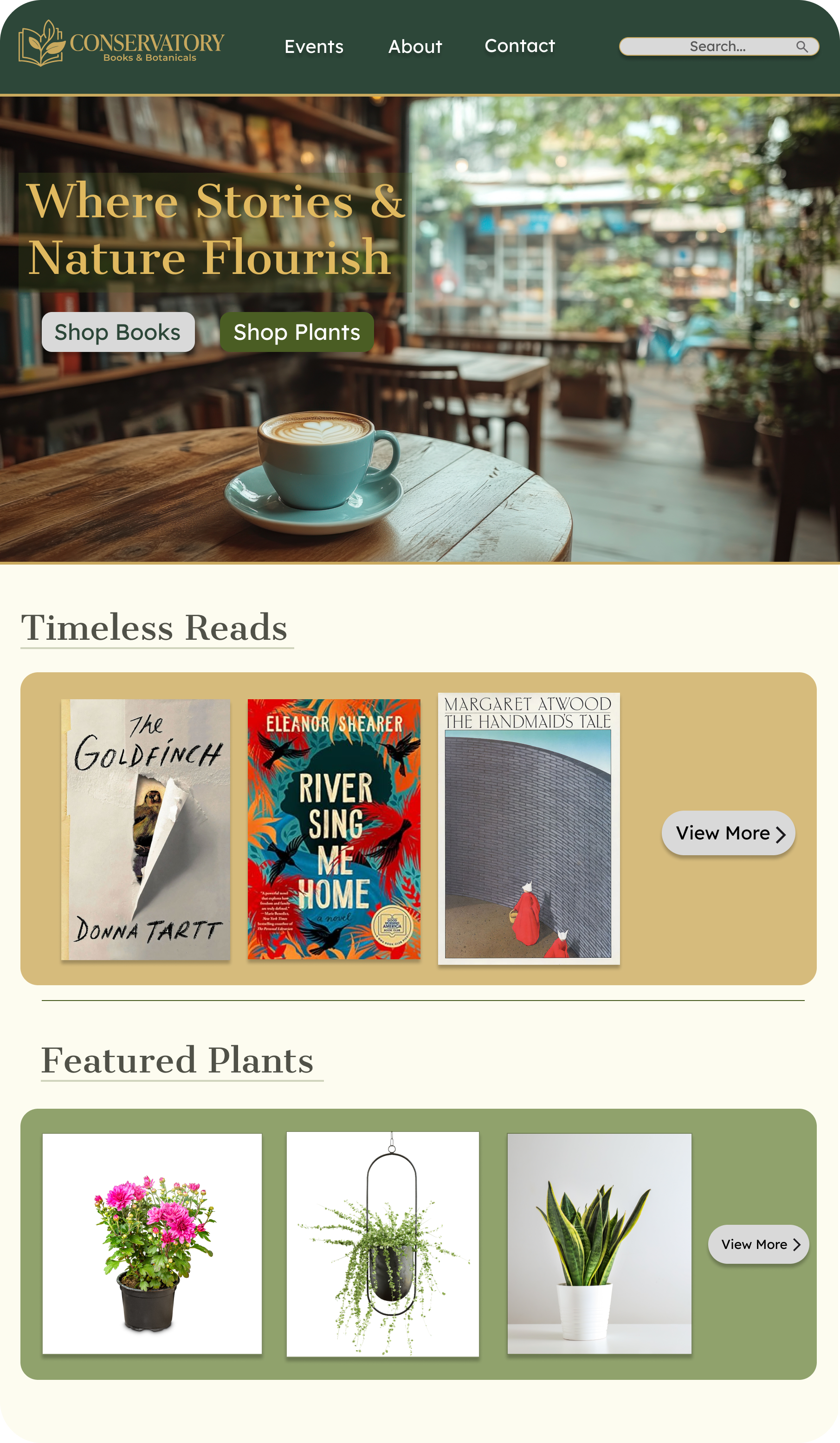
The website brings events, book and plant discovery, store search, and community updates into one place so customers can stay connected to the shop.


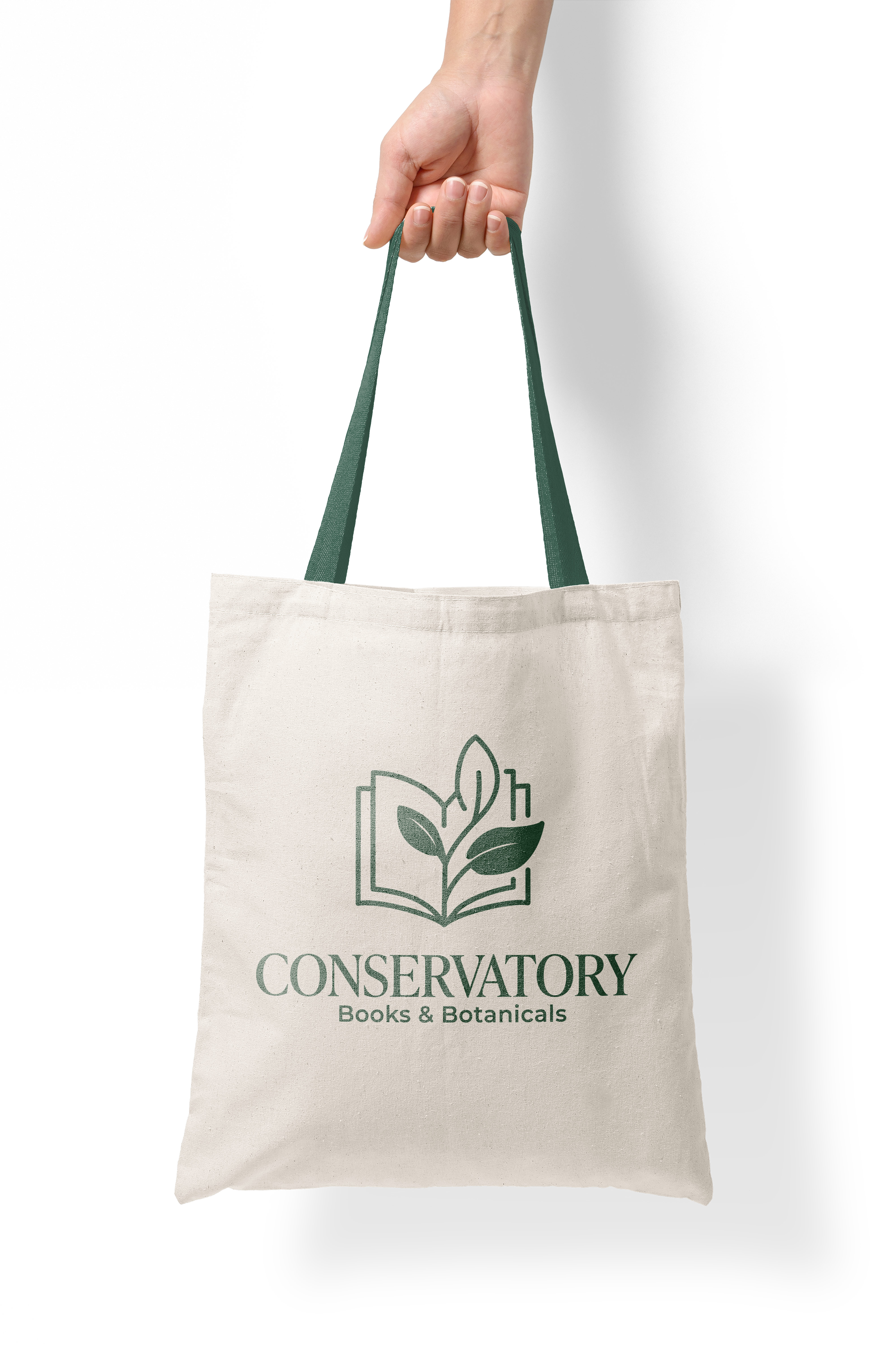
The final identity gives Conservatory a quiet, consistent presence across signage, packaging, print, and small in-store details.